Editorial Design · Branding · Automotive Culture
Overview
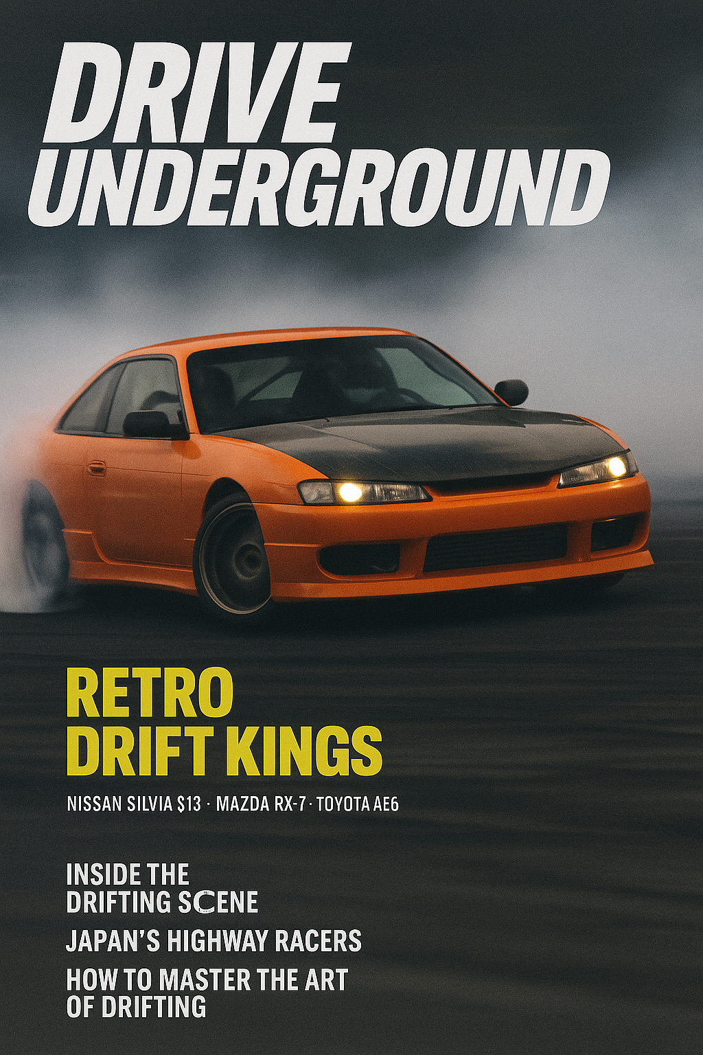
Drive Underground is a conceptual automotive magazine exploring how editorial design can capture the intensity, speed, and visual chaos of drift culture through typography, layout, and motion-driven composition. The project focused on translating the energy of underground motorsport into a cohesive and publishable editorial system.
Role
Editorial Design, Identity Design, Layout Direction
Tools: Adobe InDesign, Illustrator, Photoshop
Tools: Adobe InDesign, Illustrator, Photoshop
The Challenge
Create an editorial experience that communicates the aggressive energy and unpredictability of drift culture while maintaining readability, hierarchy, and visual structure across long-form print layouts.
Goals
Capture the atmosphere and movement of underground motorsport culture
Balance expressive layouts with strong readability and hierarchy
Create a publishable editorial system with a recognizable visual identity
Use typography and composition to reinforce motion and intensity
Design Solution
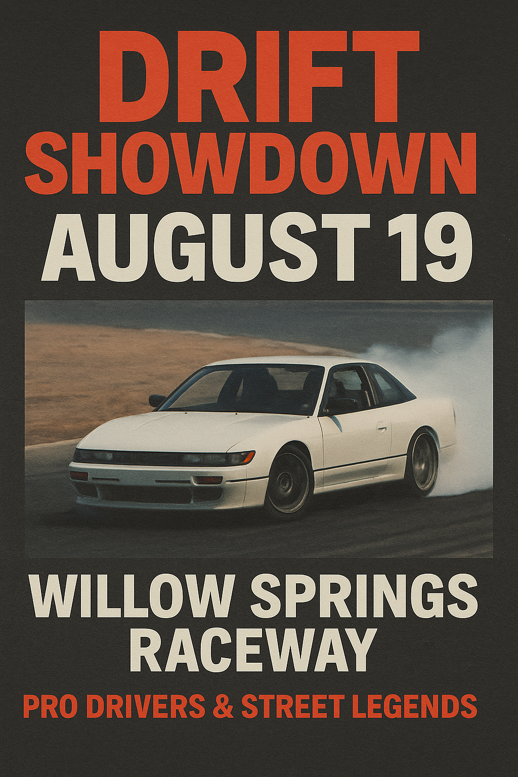
Developed an editorial system built around expressive typography, layered graphic textures, and asymmetric grid-based layouts inspired by motion, speed, and urban racing culture. The design combines structured editorial pacing with intentionally chaotic visual elements to reflect the unpredictability of drifting while maintaining navigable and readable spreads.
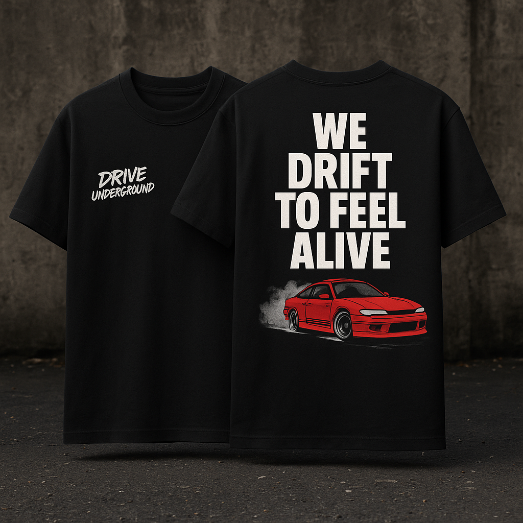
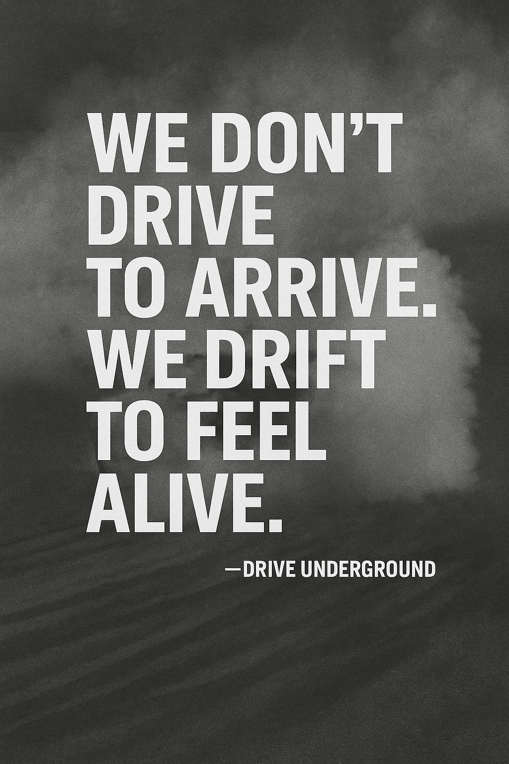
The visual system extends across cover design, feature layouts, pull quotes, and supporting graphics to create a cohesive editorial identity throughout the publication.
Outcome
The final publication transforms the underground energy of drift culture into a cohesive editorial experience that feels both culturally authentic and professionally publishable. The project demonstrates editorial storytelling through typography, pacing, composition, and visual hierarchy while maintaining a strong and recognizable design identity.